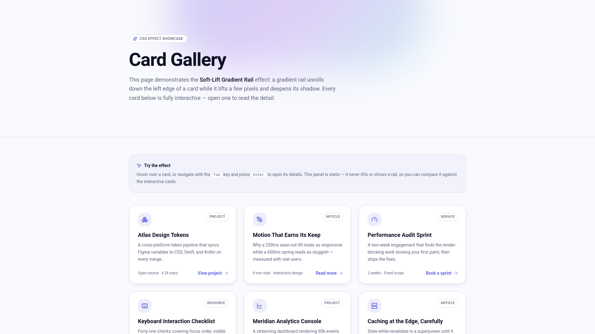
Add a Soft-Lift Gradient Rail to Interactive Cards
Add a polished hover lift, luminous gradient rail, colored glow, and accessible interaction feedback to cards on an existing Lovable site.
Tutorial ForgeUpdated Aug 5, 2026
Preview the Finished Effect
Open the interactive preview before adding the effect to your own site.
Move your pointer over the cards to see the soft lift, colored glow, stronger shadow, and luminous gradient rail. You can also press **Tab** to move through the interactive cards and verify that the effect works with keyboard focus.
After testing the effect with a pointer, use the **Tab** key to navigate through the cards. Important visual feedback and controls should remain available to keyboard users and should not depend on hover alone.
Small visual effects can make a website feel more responsive and polished.
In this mini tutorial, you'll enhance existing interactive cards with a soft shadow, a slight hover lift, a colorful accent rail, and a luminous glow that becomes stronger during interaction.
You can use this effect on many types of clickable cards, including articles, products, projects, services, profiles, events, or dashboard links. It also supports keyboard navigation, touch devices, and reduced-motion preferences.
What You'll Learn
In this mini tutorial you'll learn how to:
- Improve existing interactive cards without rebuilding them
- Add a soft hover lift and stronger shadow
- Reveal a glowing gradient accent rail during interaction
- Add a controlled colored glow around the card
- Make hover styling work for keyboard users
- Test the effect on desktop, mobile, and with reduced motion
Before You Begin
Use an existing Lovable site that contains cards or similar repeated content blocks.
Choose cards that people can click, open, or interact with. This tutorial changes their visual presentation only; it should not recreate the cards or alter their existing content, links, controls, or behavior.
Use Motion Only on Interactive Elements
Do not apply this hover lift to static statistics, informational panels, or decorative containers. Movement, stronger shadows, and pointer feedback can make a static element appear clickable.
Step 1 — Choose the Cards
01
Identify the Interactive Cards
Open your existing Lovable site and decide which card style should receive the effect.
Good candidates include cards that:
- Open another page or view
- Contain a primary link or button
- Reveal additional information
- Include controls people can use
Avoid applying the effect to every container on the page. Using it selectively makes the interaction clearer and keeps the design from feeling too busy.
Step 2 — Choose Colors That Match Your Site
Before adding the effect, ask Lovable to review your current design and confirm how the glow should fit your theme.
The same glow colors will not work equally well on every site. A bright cyan glow may suit a dark technology interface, while a warm amber or rose glow may better complement a light editorial or lifestyle design.
02
Plan the Effect Around Your Theme
Copy the following prompt into Lovable.
Choose the Theme and Glow Colors
Before changing any code, inspect the existing site and identify its current design system, including its primary color, accent color, background and surface colors, border colors, shadows, card styles, and any existing CSS variables or design tokens. Then ask me a short set of questions so we can choose a Soft-Lift Glowing Gradient Rail treatment that fits this specific site. Ask: 1. Should the effect support light mode, dark mode, or both? 2. If the site supports both themes, should the glow use different colors or intensity levels in each theme? 3. Should the glow feel subtle, balanced, or vivid? 4. Which existing brand colors should be used for the rail and outer glow? Suggest two or three combinations based on the colors already present in the site. 5. Which interactive card or repeated component should receive the effect? 6. Are there any pages, card types, or static panels that must not receive it? Briefly summarize what you discovered in the current theme, present your recommended color combination, and wait for my answers. Do not edit files, generate CSS, or apply the effect until I respond and confirm the choices. Do not invent a new palette when suitable site colors or design tokens already exist. Ensure any recommendation will preserve readable contrast and visible keyboard focus in every selected theme.
Reviews the existing design and asks for theme choices before applying the card effect.
Answer Lovable's questions before continuing. If it suggests several combinations, choose the option that best matches your site's existing visual identity.
Step 3 — Add the Card Effect
03
Style the Existing Interactive Cards
Copy the following prompt into Lovable.
Add the Soft-Lift Gradient Rail Effect
Add a reusable Soft-Lift Glowing Gradient Rail CSS effect to the existing interactive cards on this site. First identify the repeated card component that users can click, open, or interact with. Improve only that existing component without recreating it or changing its content, links, controls, data, functionality, routes, or responsive layout. Give each selected card very rounded corners, a subtle border, its existing background, and a soft default shadow. Make the card a relative overflow-hidden group so it can contain a decorative accent rail. On pointer hover at the small-screen breakpoint and above, slightly strengthen the border, use a stronger soft shadow, and translate the card upward by no more than 0.25rem. Add a 0.375rem-wide absolute vertical rail along the entire left edge. Hide the rail initially with scaleY(0), use the top as its transform origin, fill it with the site's existing primary gradient or accent colors, and reveal it smoothly with scaleY(1) when the card is hovered or contains keyboard focus. Give the revealed rail a bright colored bloom using one or two blurred pseudo-elements or layered shadows based on the primary and accent colors. On hover and focus-within, add a clearly visible but controlled colored glow around the card using layered box shadows: retain a soft neutral elevation shadow, add a medium-radius primary-color glow at low opacity, and add a wider accent-color glow at even lower opacity. The glow should extend beyond the card without obscuring its content, reducing text contrast, or clipping against the card grid. Add enough spacing around the grid items for the glow to remain visible. Keep the resting state calm and make the full glow appear only during hover or focus-within. Use subtle 200–300ms ease-out transitions for the shadow, border, rail, and transform. If the card contains actions that are visually hidden on larger screens, reveal them on both card hover and focus-within, but keep them visible and discoverable on touch-sized screens. Preserve clear keyboard focus indicators for every interactive element; the decorative glow must not replace the focus indicator. Respect prefers-reduced-motion by removing the lift and nonessential animation when reduced motion is requested, while allowing an immediate nonanimated glow and rail state for focus. Reuse the site's existing color, radius, shadow, glow, and transition design tokens where available. Apply this treatment only to genuinely interactive cards. Do not add it to static statistics, informational panels, decorative containers, or other non-clickable elements. Preserve the site's current visual identity and all existing functionality. Change only the styling necessary for this effect.
Adds a soft lift, luminous gradient edge, colored glow, and accessible interaction treatment to existing cards.
Wait for Lovable to finish, then review the changed cards before continuing.
Step 4 — Verify Pointer and Keyboard Interaction
04
Test Every Interaction Method
On a desktop or laptop, move the pointer over one of the updated cards.
Confirm that:
- The card rises only slightly
- The shadow becomes stronger without looking harsh
- A colored glow becomes clearly visible around the card
- The luminous gradient rail grows smoothly from the top of the left edge
- The glow does not obscure text or get clipped by the grid
- Any card actions remain clear and usable
- Nearby content does not shift or jump
Next, use the **Tab** key to move focus through links, buttons, or controls inside the card.
Confirm that the gradient rail also appears when the card contains keyboard focus. Every focused control should retain a clear focus indicator.
Step 5 — Test Mobile and Reduced Motion
05
Check Responsive and Motion Preferences
Open the responsive preview and test the cards at a mobile width.
Verify that important links and controls remain discoverable without hover. Touch devices do not have a dependable hover state.
Then enable **Reduce motion** in your operating system or browser tools and reload the page.
Confirm that the cards do not lift and that nonessential animation is removed or minimized. The content and interactions must remain fully usable.
Mini Tutorial Checklist
Let Interaction Guide the Styling
Use lift, hover shadows, and animated accents to reinforce elements that people can interact with. Keep purely informational panels visually stable so the interface remains predictable.
Card Effect Complete!
Your interactive cards now respond with a soft lift, luminous colored glow, and bright gradient accent rail while remaining accessible across pointer, keyboard, touch, and reduced-motion experiences.